IMPACT
Design a project dashboard
Report results in a consistent and visual way to make it easy to share and discuss how you are doing.
Preview how this activity will happen in this two-minute video from the template. Turn on closed captioning to read instructions in your preferred language.
Once you’ve chosen a set of measurements to report against, you’ll need a format that allows you to easily track and communicate progress, so everyone can see the difference being made.
Why design a project dashboard?
Taking time to show progress against key measures will improve communication among team members and wider stakeholders. A visual report card or project dashboard is instantly understandable in ways that lengthy, text-based reports are not.
There are different ways to design a report card, you could
Create one from scratch yourself
Copy a layout used by others
Hire someone to create one for you
Use specialist dashboard software
A good approach produces a report card or dashboard that will:
Present all the key information clearly
Highlight what’s working well and what is not
Show trends as well as targets
Allow people to get more detailed information if they need it
Inspire regular use
We recommend you:
Make a number of images for each measurement in your set
Create a simple grid to limit your choices
Build your ideal dashboard
Discuss your choices and tradeoffs
Decide on a final design
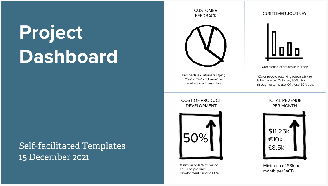
What does designing a report look like?
Now you know the essentials, why not make a start on designing your project dashboard today?
HOW?
Get started
Our self-guided activities do all the work for you.
Get personal help right away!
Sometimes you need to speak to an expert who can help you get a critical project over the line. We are here to help.
Make this page better
Leave comments directly in this Google Doc suggesting ways in which we might improve this page.
Everyone who provides feedback will be entered in a monthly drawing to win a free one-hour coaching session!
